Principles and Elements Postmodern Panorama Art Book
Materials:
Magazines
Colored Construction Paper
Glue
Scissors
Colored Pencils, Markers, Paint, Crayons
Chose two contrasting sign shapes or symbols. This will bring unity to the piece. Make two of these by cutting them out of the magazines. Unity is created because the same basic shape is repeated throughout the composition; Unity is often created by repetition of art elements.
Use the repeated signs or symbols codes or messages to the viewer to stop, go, or yield for example. By mixing signs you can prompt interest by forcing the viewer to think about what your intentions are.
Make 10 more of these sign shapes. Vary the size and shape. Vary the proportions of the sides of the shapes. Make some variations as dramatic as possible. Create contrast. Variety and interest are attained by making variations of the basic shapes.
Arrange the shapes to create a feeling of movement and rhythm in the composition. Try to create a sense of movement along the long horizontal page of the whole accordion book.
By mixing media and using colored pencils, markers, paint, and/or crayons add lines, which will enhance the sense of movement and emphasis in your piece.
Enhance the composition by creating areas of pattern and texture through repetition of points, lines, or shapes.
Consider the entire composition. Does it have symmetrical or asymmetrical balance?
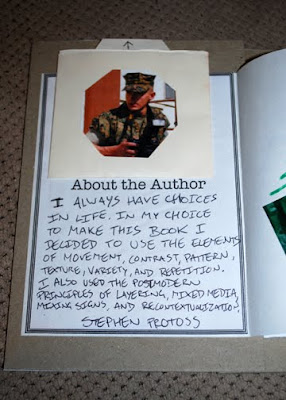
Finish book by making an “About the Author” page and a cover, which displays your knowledge of a wide vocabulary of visual art elements and principles as well as postmodern concepts.


I really like how your book came out. There is a lot of movement because of the shapes that you chose. Also, the contrasting colors of green and red, and the repetition of patterns are very effective.
ReplyDeletePost modern theme:
ReplyDeletecollage, contrast
Skills/content: repetition, contrast, mixed media
social concern/theme: Making choices
Provide one response of constructive feed back:
The only thing that I was confused about in your directions is cutting the shapes out of the magazine. In your book it is obvious that you chose two contrasting colors, and I think that this was part of the reason why your book was very successful. In your directions you do not specify if this is a requirement or not.
Postmodern themes: Assemblage, Social Commentary
ReplyDeleteLots of different colors and images but still looks really cohesive. First book I have seen with a message so far, looks good.
Maybe some more text?
I think overlapping the shapes and patterns could make a lot more complex and interesting compositions. Your shapes avoided the edge of the page making the whole thing seem very cramped. I feel the arrows moving in one direction hurt the piece as the viewer looks across it once and doesn't look back to further exampine your patterns and symbols The octagon with red and arrow with green are good choices due to our existing connotations between these colors with their corresponding shapes.
ReplyDeleteThanks, I think you missed the purpose of the assignment.
ReplyDelete